
Task 1 – the blog post
Website: BuzzFeed
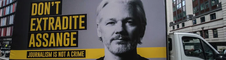
Bradshaw explains in his book that visual is the key to thrive in the digital age in addition to brevity (Bradshaw, 2018), however it seems like BuzzFeed didn’t get the memo. While on the article we can see a very long review on the Coronavirus and how the hospitals and the government respond to this, there are only two items of visual content.
To be continued…
The journalists wrote more than 28 paragraphs and added only two photos, while none of them is really interesting or valuable to the reader. Therefore, the reader scrolls and scrolls, lost in so many words and lines with no visual to the rescue. In my opinion, the journalists should consider chunking as Bradshaw recommends and add more photos with the Coronavirus theme, such as a map of the infected countries.
In addition, the story failed to add links to other related stories. Although most of the people in the world must be aware of the Coronavirus situation, I suggest having links to other basic stories that can give background on the issue for those who lived under a rock for the past two and a half months. Giving background makes the website more credible.
Bradshaw, P. (2018). The Online Journalism Handbook: Skills to survive and thrive in the digital age (pp. 72–133). Routledge.


Entertaining post, with good use of relevant keyword tags and an SEO-friendly headline.
Your in-text Bradshaw reference requires page numbers.
Yes, the article is a wall of text, which makes it very difficult to scan. You might suggest ways (other than using a map as a visual to break up text) that brevity might be employed, for example by using bullet points, or linking to separate related stories instead of including all that information in an already overly-long news report
It’s worthwhile making note of the author’s linked profiles at the top of the story, and how easy or difficult it might be for users to comment – I found the “Be one of the first to comment” button at the top took me to related content towards the bottom of the page, with the comments link above that – confusing!
Your images are relevant and sized correctly, but should have captions and credits attributing the source, and alt-tags.