
The news I read is about 2018 Youth Survey from BuzzFeed.
The online delivery can be improved in the following two parts: Readability, relating to the information delivery, and functionality and usability, referring to the user experience of reading this report.
Readability
- Links
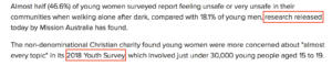
There are at least two places mentioning reports can add links to increase the credibility to the story. One link can be attached to “research released today by Mission Australia” in the second paragraph. The other one can go with “2018 Youth Survey”.
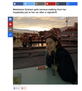
- Image size and captions
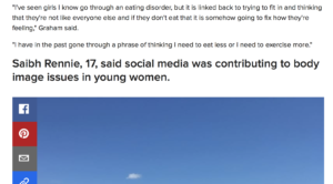
Images in the story should be smaller to avoid the impediment to fluently reading. Meanwhile, the caption should be smaller or grey and under the image, otherwise it looks like a subheading.
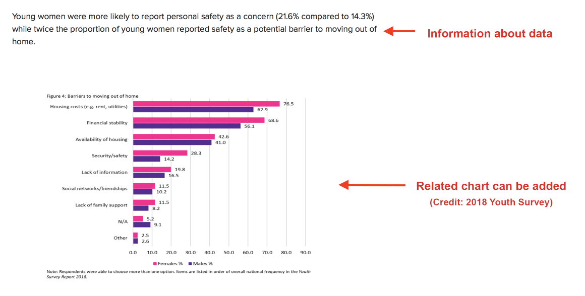
- Charts
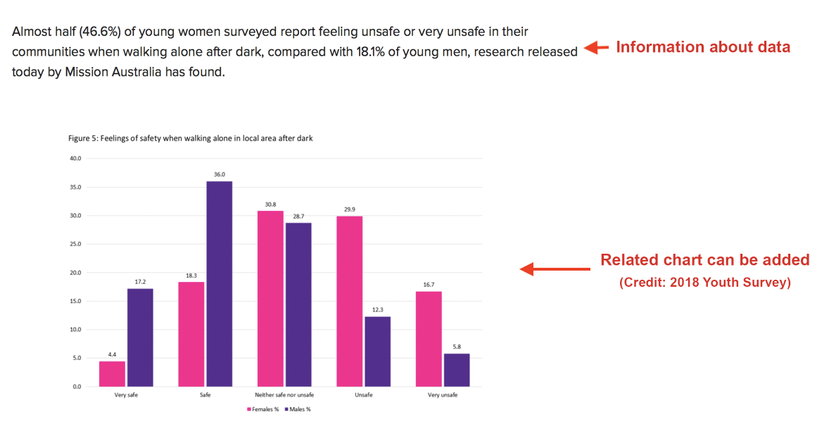
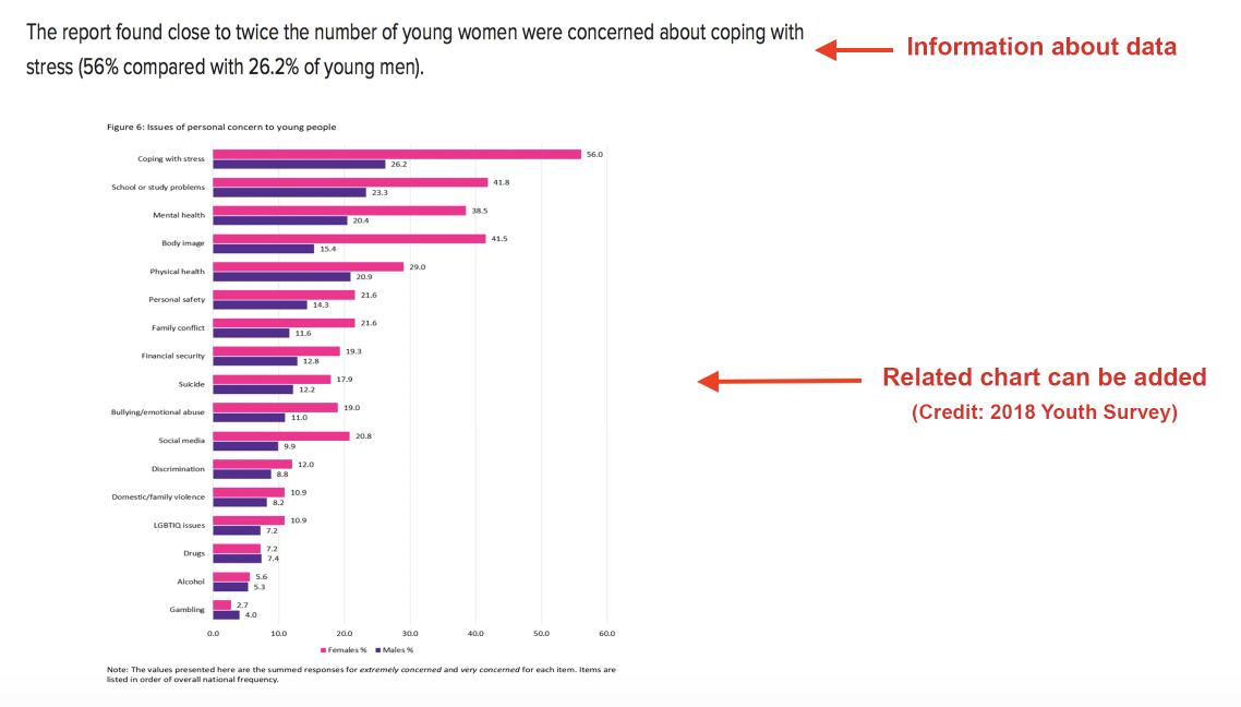
Charts can be added for easily reading and intuitively understanding when sets of data are mentioned in the story. (click the figure for a clear view).
Functionality & Usability
- Amplification of characters and images
The function of enlarging the characters with cursor moving, and the display of detailed picture information when click on it should be provided.
- Share buttons
The number of share buttons should be reduced to avoid the confusion and distraction led by too many buttons.


Good observations about the potential for added links and amplified images Yani. Only one link is needed to the survey report though. What you are calling captions are actually like pull quotes, designed to draw your attention to key points. The captions are small and grey, underneath the images. As to reducing the number of share buttons, Buzzfeed strategically seeds its content on other platforms to increase attention – so it would not remove any of these unless they were not generating good metrics.
On your web writing, here’s a few suggestions
– Make links open in new tabs
– Use your precede (subheading field below post) to promote your post, rather than saying what is already in the category tag.
– Please upload an image of yourself to your blog bio to elicit trust from your readers.