This is a hard news story of Guardian supported by multimedia. It shows the related story link aside and demonstrates the image of the spokesman and the map. However, it does not indicate the sources of the map. This news story will be delivered better if it is also equipped with a short video.
Five hyperlinks are inserted in this news story. Most of them are used appropriately to let audience acquire more information, but there is one hyperlink that is cut in 2 parts and leads audiences to the same place. Besides, there is a sentence long hypertext at the end of this story. I suggest that the hypertext could be shortened into “arrest”.Moreover, all the hypertexts lead the audience to another story without opening a new tab.
As for the ads, there are only one banner ads on the top, and another one is inserted in the news text, which could make users confused whether it is related to the news.
Dialogic interactivity enables users to interact with them through Facebook, Twitter, Email. I think it would better to let users comment at the bottom. Besides, the registrational interactivity encourages users to subscribe to the news.
The keywords are relating to coronavirus and the middle east, which is easy for users to search and find this news.

You note that the story could be improved if it included video. This may be the case, but The Guardian does not usually include video in its general news stories – house style is a featured image above the story. The map is one made by The Guardian and as such does not require attribution (though it might be appropriate to credit the visual journalist who created it).
Those split links are odd, and I agree with you in questioning their effectiveness when they lead to the same story – do you think it might be an error?
Good analysis of some of the features of online journalism, and you use relevant terms. Consider also how SEO-friendly the article is, and how reader-friendly: does it employ some of Bradshaw’s BASIC guidelines? Would the article be more scannable and readable if the author used ‘chunking’ – shorter paragraphs, subheadings, more white space?
By choosing to use the Guardian headline you have ensured your own post is SEO-friendly. You also use relevant key word tags.
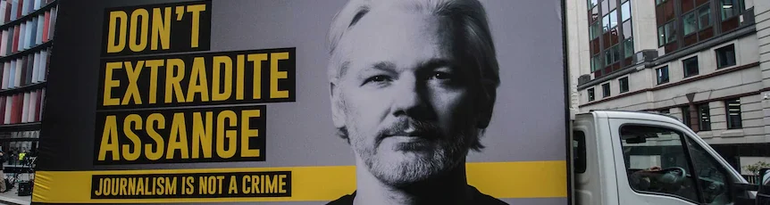
The screen shot you have used is confusing without a caption – it looks at first glance like a featured, or pull, quote. You should clearly identify it as a screenshot from the Guardian site.