
” Visuals are essentials. Sadly, there is a real human tragedy behind the statistics, the way we design and structure the narratives should account for that.”
— Yaryna Serkez, Graphics Editor at the New York Times
 Empty street at Sydney | Credit: Kassia Gao


Beyond the visible
The streets of Sydney CBD are never such empty, with few people walking and jogging, shops, and stores closing. The popular items people want to buy become masks and hand sanitizers. The truth underlying is visible on the number of death tolls caused by the COVID-19 virus.
The World Health Organization and local governments around the world set up COVID-19 restrictions that keep people stay at home, unless they are essential workers, shopping for food, or getting exercise close to home. Nobody knows when the global pandemic would end, but everyone wants to be prepared when it comes to protecting themselves under this uncertain time.
Interest and attention in data visualizations have surged during the worldwide spread of COVID-19. People desire to see and understand the current situations related to the virus: How case numbers are rising, which areas have more cases, what impacts the virus might have on themselves and their communities, and what they can do to protect themselves and slow down the spread.
COVID-19 overview
‘6 Topical Data Viz Lessons’
Data analysis about COVI-19 from Avinash Kaushik, Google’s data evangelist. A bit scary but fascinating how good data visualizations can tell a strong story!https://t.co/khYoe2hMPG#Measure #COVID-19 #Data pic.twitter.com/kDZnUDT1d8— Roy McClean (@RoyMcClean) April 3, 2020
COVID-19 viz – decision-making helper
Data researchers from government agencies, academics, media outlets, and data-processing companies, utilize and design thought-provoking visualizations to interpret constantly updated COVID-19 data, such as the amounts of tests performed, cases confirmed, death from the virus.
A multidisciplinary team of COVID-19 public dashboard project at the University of Sydney shows the cases by location in NSW, in collaboration with New South Wales Health and Australia Bureau of Statistics.
NSW COVID-19 public dashboard
“One of the differences between our dashboard and many of the others is that it gives you a sense of the temporality of the data in the spatial domain so you can see not only how many cases have existed in a particular location but also how long it has been since the last cases were there.” Said Associate Professor Adam Dunn, head of the discipline for biomedical informatics and digital health at the University of Sydney, who is one of the leaders in this team.
Such dashboards describe the overall situations of the spread of COVID-19 in the community. By mapping the COVID-19 data by postcodes, they highlight areas at higher risks of community transmissions. So, the government could measure quarantine policies or make decisions about when they might be able to reopen schools, businesses, and borders, where they should be sending more resources to.
“if we see places in NSW where there have increased in the number of cases, then we might want to consider sending more resources there. That might mean ensuring people are physically distancing. It might mean sending more protective equipment or it might mean talking to the people who run businesses in those locations.” Adam said.
Professor Adam Dunn screen share NSW COVID-19 dashboard
Visualizing COVID-19 improves public transparency. People understand the risks around them in their community, which can reduce the amount of anxiety, panic, and fear in the community to catch this disease, according to Adam.
“if you are in a place where there hasn’t been a case of COVID-19 for the last few weeks, then you can feel more comfortable about doing your usual activities, like going to the shops, meeting friends, because you’re less likely to be in contact with someone who has COVID-19,” Adam explained.
However, most data visualization, including this dashboard could not be able to visualize how often people move from place to place.
“An indication of one place being COVID-19 free for a period of time, doesn’t necessarily mean that there are no people from another postcode visiting those postcodes.” Adam said.
As mentioned in attached thread, I see communicating exponential growth (virus spread) as one of the key challenges to helping people understand #COVID19.
We just don’t think that way.
A couple of thoughts and critiques of #COVID19 vis …https://t.co/HaTxeLhrjL
— EvanMPeck (@EvanMPeck) March 9, 2020
Communicating COVID-19 – storytelling
Instead of creating visualizations of COVID-19 case data, Amanda Makulec, the Senior Data Visualization Lead at Excella with a strong public health background, focused on writing about how to visualize COVID-19 data responsibly, given data quality issues with the confirmed case amounts, and on helping people better understand the process of data production and interpretation.
.@COVID19Tracking launched a new set of charts disaggregating COVID-19 data by race, further underscoring the disproportionate impact on communities of color.
Two states still aren’t reporting this data (Nebraska & North Dakota) and that needs to change. https://t.co/oe49yLPxKF
— Amanda Makulec MPH (@abmakulec) May 28, 2020
Organizations like the COVID Tracking Project, create feeds of key metrics to understand the trajectory of the pandemic and to add more context on charts of case data like test-positivity rates or even simply the number of tests administered.
” Early on, this data was challenging if not impossible to source consistently at a state or county level,” Amanda reported.
According to Amanda, data visualizations of COVID-19 shift away from focusing only on visualizing case and death data, for example, firms like Pentagram and Reuters Graphics have worked to create novel, different ways to tell the story of COVID that goes far beyond case curves.
Pentagram represents the people behind the cases and death data points of COVID-19 in a more engaging way and tells positive COVID-19 stories using data visualizations on their platform happy-data.io.
Today’s #HappyData: Open streets!
With social distancing measures mandatory, cities across the county have closed down streets to cars, allowing residents to spend time outside while still maintaining proper distance
🌈✏️📈🌅
https://t.co/jYpWvnv083
pic.twitter.com/KMezkia75l— Giorgia Lupi (@giorgialupi) May 28, 2020
“Visual simulations (like the coronavirus simulator illustrating the potential effects of social distancing in flattening the curve and the People of the Pandemic Game) have also played a key role in enabling understanding of complex epidemiology concepts in this challenging time,” Amanda explained, ” Games like People of the Pandemic also reinforce the impact of our individual choices on our communities through an interactive, cooperative experience.”
Ethics behind Visualizing COVID-19 data
Not only data researchers face the challenges in making sure the data quality, but they face significant ethical challenges in how people visualize data about COVID-19, how data is presented, and to make sure the humanity and gravity of COVID-19 data remain in aggregate counts, bars, and lines.
Many data visualizations on social media spread without appropriate sourcing of the data or with misleading displays, for example, comparing COVID to the seasonal flu, which actually requires a more nuanced understanding of public health concepts and data.
Trump has persistently minimized the seriousness of COVID-19 by falsely comparing it to the seasonal flu. His denial and obfuscation squandered precious time, worsened the crisis, and cost lives. https://t.co/9HOqZcdZC4
— BillMoyers.com (@BillMoyers) May 28, 2020
“We do hope we can convince people to pause before they publish visualizations on a topic as sensitive as COVID-19,” Said Amanda, as the operations director of the Data Visualization Society.
Really? Looking at their interface (screenshot as of 5/28/2020 at 3:34PM) they show some deaths as Hispanic/Latino. pic.twitter.com/cHSqrzrNKG
— Amanda Makulec MPH (@abmakulec) May 28, 2020
Visualizing Discussions of COVID-19 on social media
According to Marc Smith, a sociologist, and director of the Social Media Research Foundation, visualizing social media networks can be valuable to see a broad picture of patterns and shapes of COVID-19 related discussions, since people increasingly rely on social platforms during current situations.
” Social media allows people to speak but not necessarily allows people to be heard because people can only consume limited messages per day, there are more special and influential messages delivered by politicians, celebrities. ” Marc explained.
Visualizing social networks would present comprehensive information and shorten the time people consume messages.
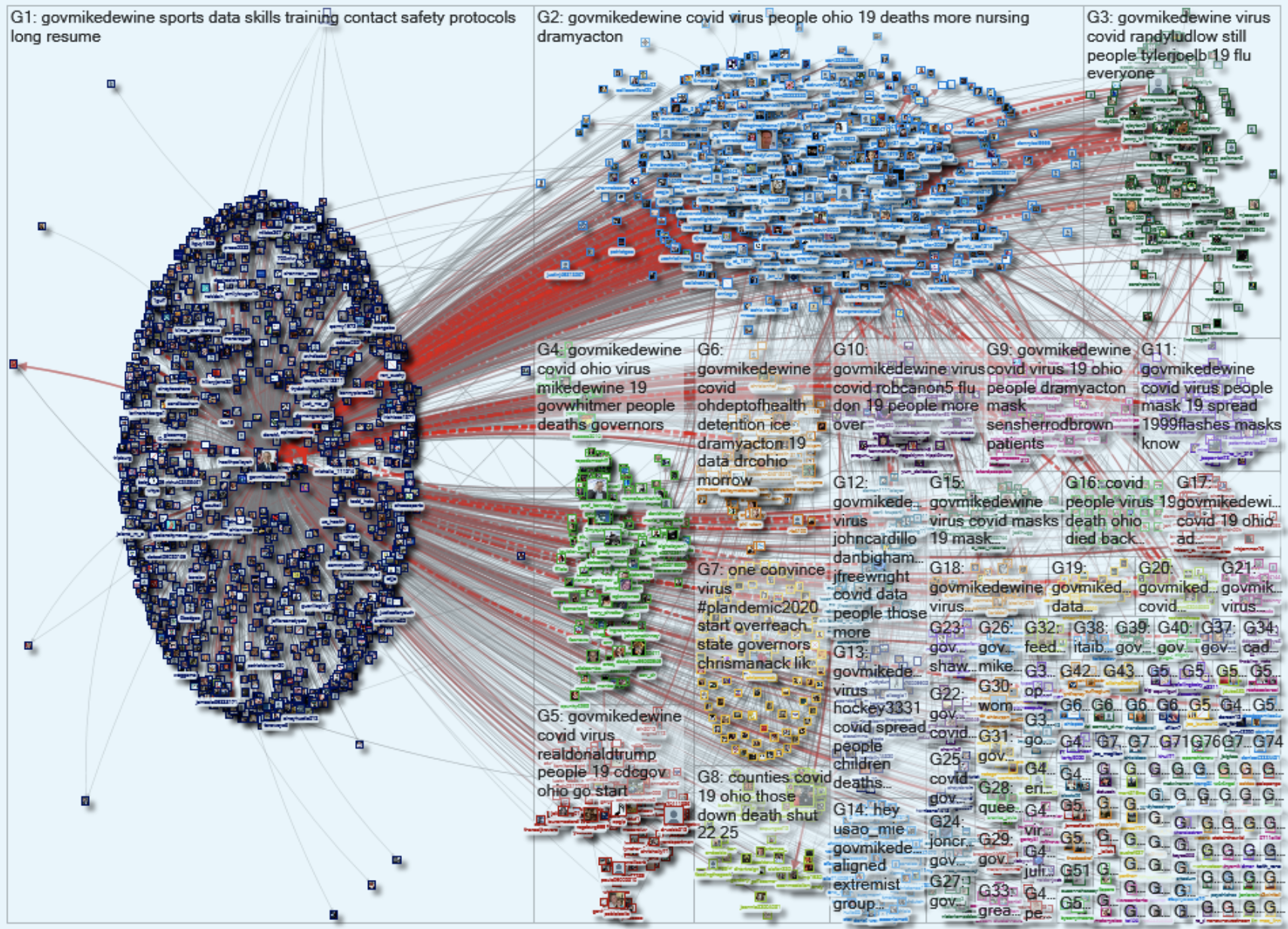
” Online conversations are networks, they have different shapes. The big circle is the governor’s account, and it generates lots of tweets, but each tweet in this circle is likely to directly connect to the governor’s account.” Marc explained the graph.
“The idea here is to give people a tool to read hundreds-thousands of tweets per day, not by reading those tweets, but to abstract the essence of those messages,” Summarized Marc.
Move forward visualizing COVID-19
The information itself does not visible or makes sense sometimes, good data visualizations make the invisible visible.
As consumers of data visualizations, we want to understand the data thoroughly, quickly, accurately, so we should support and encourage high-quality data visualization and be responsible for what we share.


Be the first to comment