
A number of online features of the recent Daily Mail article regarding the coronavirus’s upgrade to a pandemic by the World Health Organisation can be improved.
Scannability
The article is incredibly long foregoing brevity in an attempt to cover every single development of the escalating crisis beyond just the pandemic announcement.
A large amount of additional information is provided including blue boxes that answer questions about the virus. On desktop these boxes are placed to the side but on the mobile version they interrupt the text of the main article and make it difficult to navigate and follow.
Subheadings are used sparingly and when used are long, again making it harder to scan.
Multimediality
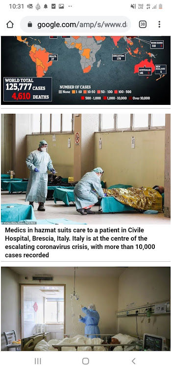
Large bodies of text are followed by numerous photos, maps, and videos one after another. It would be more effective to use this material more sparingly and as a way to break up the text blocks, inserted after relevant information.
For example, the map of confirmed cases and deaths around the world could have been included after the text “more than 125,000 people globally have already been infected with the corona virus”. This sentence foreshadows the meaning of the image.
Instead the map is listed with photos of corona virus patients and medical workers in protective gear. These photos themselves are not super relevant to the text they follow.
Hypertextuality
It would be more useful to keep the article brief and hyperlink with short phrases to the extra information it has provided as seperate articles.
Where hyperlinks are provided they link to a list of Daily Mail articles on the topic (for example coronavirus and the Republic of Ireland).
Hyperlinks to specific articles and sources would be more useful. For example information on the criteria of pandemic could have been attributed with a hyperlink.

Great blog post – your analysis utilises techniques of good online journalism (short paragraphs, subheadings, a relevant image to break up text and illustrate the points you make). Your headline is SEO-friendly, you have assigned relevant key word tags, and the use of heading tags for your subheadings (instead of bold text) adds to SEO.
You use the appropriate naming conventions for the features and functions of the DMA story, and using some of them as subheadings helps a reader scan your post to make sense of the structure before reading in depth, which is exactly as it should be! You might have also referenced Bradshaw or other readings.
Where you suggest the story could link to additional information about the pandemic, or more articles and sources, could you find examples to link to?